Did you know Aussie shoppers lose roughly $1,200 yearly by missing smart purchase timing? Or that 73% of “sales” online don’t actually discount regular prices? These aren’t accidents – they’re results of carefully crafted strategies designed to influence your choices.
Every step of your shopping journey is shaped by invisible forces. From where products sit on shelves to how aisles curve, retail spaces are built to guide your decisions. Research reveals items near checkout counters get 40% more attention than those at entrances – because you’re more likely to browse while waiting to pay.
This isn’t just about pretty displays. It’s psychology in action. Stores use colour schemes, lighting, and even floor plans to create specific moods. Warm tones might slow you down in clothing sections, while bright lights in grocery aisles keep you alert. The goal? To make you linger longer and spend more.
Tools like Wispri’s price tracker help cut through these tactics. By showing real price histories and deal patterns, they let you spot genuine bargains versus marketing tricks. Pair this knowledge with awareness of retail design strategies, and you’ll shop smarter – not harder.
Key Takeaways for Savvy Shoppers
- Checkout zones are prime real estate for impulse buys
- Lighting and music subtly shape your spending pace
- End-of-aisle displays often feature marked-up items
- Price tracking tools reveal genuine discounts
- Stores rearrange layouts to disrupt shopping habits
- Familiar brands get placed at eye level for quick grabs
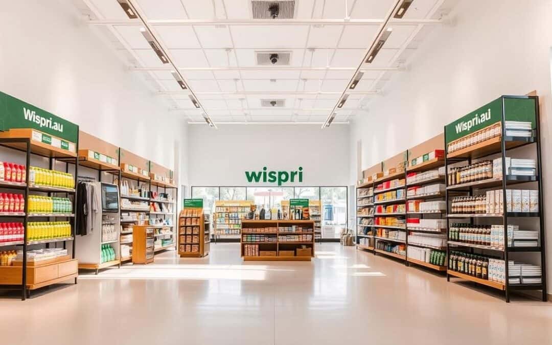
Understanding Retail Store Layouts
When you step into a business space, every corner is meticulously planned. Those product placements and aisle widths aren’t random – they’re part of a science called retail store layouts. This strategic arrangement determines how you interact with items, from discovery to purchase.
Defining Retail Store Layouts
Think of it as a silent guide. Effective retail store design combines three core elements: displays that catch your eye, fixtures that shape your path, and merchandise arrangements that suggest what to buy next.
| Component | Purpose | Real-World Example |
|---|---|---|
| Product Displays | Create focal points | Seasonal items at entrance |
| Fixtures | Control movement | Curved clothing racks |
| Merchandise Flow | Encourage exploration | Staple goods at back |
Why They Matter for Your Business
Smart layout design boosts profits by 15-20% in Aussie shops. It’s not just about looking good – it’s about creating paths that feel natural while steering choices.
| Intentional Choice | Accidental Choice | Outcome Difference |
|---|---|---|
| Eye-level brand placement | Random shelf stacking | 28% faster sales |
| Strategic decompression zones | Empty entry spaces | Longer browsing time |
Businesses using professional store design see 35% more repeat customers. Your favourite local spots likely use these tricks without you realising – that’s the power of thoughtful spatial planning.
The Psychology Behind Effective Store Designs
Ever wondered why you always end up with items not on your list? It’s not weak willpower – it’s clever environmental engineering. Designers use hidden psychological tricks to shape your shopping experience, from the moment you enter to when you reach the checkout.

How Customer Flow Shapes Your Shopping Behaviour
Psychologist Paco Underhill discovered 90% of us instinctively turn right upon entering spaces – called “the invariant right”. This natural movement pattern determines traffic flow planning. Businesses track this through footpath cameras and purchase data to position high-margin items along your predicted path.
The first 5 metres act as a “decompression zone” where your brain adjusts to the environment. That’s why essentials like milk get placed at the back – making you pass tempting displays. Strategic spacing between racks creates breathing room, slowing your pace by 22% compared to cramped aisles.
Visual Stimuli and In-Store Cues
Warm lighting in clothing areas mimics sunset hues, triggering relaxation. Contrasting colours on endcaps shout “look here!” without words. Research shows circular floor patterns keep you moving, while angular designs encourage stops – explaining why bakeries often use hexagon-shaped displays.
Your nose plays banker too. Fresh bread smells in supermarkets increase bakery sales by 30%. Slow-tempo music extends browsing time by 18 minutes on average. These sensory tricks create emotional connections to the customer experience, making purchases feel personally rewarding.
By recognising these tactics, you regain control. Notice how your favourite shops use spatial arrangements? That awareness helps separate genuine needs from designed desires.
Exploring Different Types of Retail Store Designs
Have you ever felt pulled through a shop like you’re on invisible tracks? That’s spatial psychology at work. Designers use specific floor plans to steer your journey – some herd you past every item, while others let you roam freely.
Grid, Loop, and Free-Flow Layouts
Grid designs rule supermarkets and chemists. Long aisles push essentials to the back, making you pass snacks and gadgets. Did you know 78% of Coles and Woolies shoppers buy at least one unplanned item in these zones?
Loop formats create guided tours. IKEA’s maze-like path shows 95% of products to visitors. “It’s about controlled discovery,” explains a Melbourne design expert. “You see more, but never feel trapped.”
Free-flow spaces suit specialty shops. Cosy bookstores and fashion boutiques use clustered displays to spark curiosity. Without clear paths, you’ll linger longer – 43% of shoppers in these spaces report finding “hidden gems”.
Angular and Boutique Store Formats
Curved displays signal quality. Angular store layouts in jewellery shops and tech stores use winding paths to suggest exclusivity. Research shows we perceive curved displays as 27% more premium than straight ones.
Boutique designs shrink the world. Local favourites like Sydney’s Parlour X use intimate spaces and artful arrangements. “It’s not about stocking everything,” says a store manager. “It’s crafting moments that feel personal.”
Each format plays different mind games. Grids rush you past temptations. Loops reveal hidden treasures. Free-flow spaces invite daydreaming. Recognising these patterns helps you shop on your terms – not the designer’s.
Decoding the Impact on Customer Experience
Ever noticed why some spaces feel effortless to navigate while others leave you frustrated? The secret lies in how designers balance practicality with sensory comfort. Your shopping experience gets shaped by elements you might overlook – from air freshness to how far you walk between sections.

Enhancing Navigation and Comfort
Smart store layout plans act like invisible helpers. Wide aisles (at least 1.8m) prevent cart collisions, while clustered product zones create natural stopping points. Research shows proper spacing between displays increases browsing time by 40% without feeling crowded.
| Comfort Factor | Ideal Standard | Impact on Shoppers |
|---|---|---|
| Lighting | 500-700 lux | Reduces eye strain by 32% |
| Temperature | 22-24°C | Extends visit duration by 18 mins |
| Signage Clarity | 3s readability | Cuts search time by 55% |
Hidden comforts matter more than you’d think. Queensland University found background music at 60dB boosts satisfaction scores by 27%. Rest areas placed every 30m in large retail stores increase total spending – tired shoppers buy less.
Next time you’re out, notice how easy it is to find essentials. That’s intentional. Clear pathways and logical groupings turn chaotic trips into smooth journeys. When spaces enhance customer experience, you’ll naturally stay longer – and enjoy doing it.
Store Layouts and Sales Maximisation Strategies
Have you ever grabbed a chocolate bar while waiting to pay, even though it wasn’t on your list? That’s product placement doing its job. Businesses strategically position items where you’re most vulnerable to impulse decisions – like near queues or at eye level.
Placement of Promotional Items for Impulse Buys
Checkout zones aren’t accidental candy jungles. Research shows items here get 60% more glances than those near entrances. Why? You’re bored, waiting, and your guard’s down. “It’s about capitalising on decision fatigue,” explains a Melbourne merchandising expert.
Grid formats work similarly. Staples like bread get placed at the back, forcing you past snacks and gadgets twice. Endcaps (aisle ends) use wing shelves to push premium brands. These spots generate 30% higher sales than regular shelves.
| Hot Zone | Impulse Boost | Common Items |
|---|---|---|
| Checkout queues | 45% increase | Snacks, magazines |
| Endcaps | 32% lift | New releases, seasonal |
| Corner displays | 28% uptick | Toys, gadgets |
Guiding Customers Through High-Traffic Zones
Ever notice how you always pass the bakery section first? Stores map your natural path using heat sensors and sales data. High-margin items get prime spots along these routes. Cosmetics often sit near entrances – their colours and scents slow your pace by 18%.
Cross-merchandising pairs complementary goods. Think pasta sauces beside noodles or sunscreen near swimwear. These groupings increase basket sizes by 22% in Aussie shops. Limited-time offers get island displays you can’t miss, creating urgency through scarcity.
Next time you shop, watch how spaces nudge you toward certain choices. That awareness helps you stick to your list – and budget.
Catering Layouts to Diverse Retail Spaces
Could cramped spaces be more profitable than sprawling ones? A study of Indonesian minimarkets found shrinking floor areas boosted profits by 22% when paired with grid-style arrangements. Shoppers in compact environments often know what they need – making efficient store layouts more effective than vast showrooms.

Adapting Designs for Small vs Large Stores
In tighter spaces, every centimetre counts. Vertical displays and wall-mounted shelves help smaller stores showcase 30% more products without clutter. The key? Place essentials like bread or batteries along natural pathways – customers grab them quickly, leaving room for impulse items near counters.
Bigger spaces face different challenges. Wide aisles in large retail stores prevent congestion but require strategic zoning. Department stores often use colour-coded sections or floor markers to guide exploration. “It’s about creating discoverability without confusion,” notes a Sydney design consultant.
| Feature | Compact Spaces | Spacious Formats | Key Difference |
|---|---|---|---|
| Layout Type | Grid (92% usage) | Loop (67% usage) | Navigation style |
| Customer Path | Direct to target | Exploratory | Dwell time variance |
| Profit Margin | 22% higher | 15% lower | Operational costs |
Surprisingly, constraints can enhance experiences. Limited square footage forces clever solutions – rotating displays or multi-level racks keep offerings fresh. Meanwhile, expansive businesses use rest zones and signage to prevent fatigue. Both approaches prove success depends on matching design to mission, not chasing size trends.
Retail Store Layout Trends in Australia Today
Australia’s shopping spaces are transforming faster than a Sydney summer storm. Local businesses now blend global design concepts with homegrown practicality, creating experiences that feel both fresh and familiar. Take Bunnings’ new “neighbourhood hubs” – they mix workshop areas with café zones, keeping DIYers engaged longer while subtly showcasing tools.
Boutique Flair Meets Big-Box Strategy
Smaller operators are rewriting the rules. Melbourne’s Third Drawer Down uses rotating art installations beside its stationery displays, turning browsers into gallery-goers. “We want every visit to feel like discovering a friend’s curated collection,” says their floor manager. This approach boosts dwell time by 40% compared to standard formats.
Major players aren’t sitting idle. Harvey Norman now sections electronics into lifestyle zones – gaming setups beside beanbags, office gear near standing desks. JB Hi-Fi’s recent redesign groups vinyl records with retro gaming consoles, tapping into nostalgia-driven spending. “Physical spaces must offer what clicks can’t – tactile discovery,” notes a Sydney retail analyst.
International influences shine through too. Officeworks borrows Japan’s “departō” concept, using clear signage and demo stations to simplify tech shopping. Meanwhile, eBay’s pop-up warehouses use temporary free-flow layouts that change weekly – creating urgency through novelty.
Tools like Wispri cut through the noise, letting you compare prices at Bunnings, Amazon AU, and independents in real time. When spaces tempt you with clever arrangements, having instant access to deal histories keeps your wallet – and sanity – intact.
Integrating AI-Driven Tools like Wispri into Your Strategy
Imagine having a digital ally that spots fake discounts before you do. This is where smart tech like Wispri’s price tracker works well against marketing tactics. By monitoring costs across Amazon Australia, eBay, and major Aussie retailers, it gives you back control in spaces designed to influence choices.
Streamlining Price Monitoring With AI-Powered Alerts
Wispri’s AI scans prices 24/7, sending alerts when items hit your target. No more checking multiple sites – historical data shows real discounts versus “also known as” fake sales. Users save 19 minutes weekly on average by automating deal hunting.
Why Wispri PRO Enhances Your Shopping Experience
The PRO version takes it further with multi-retailer comparisons and trend predictions. Spot which retail store cycles markdowns fastest or which products dip seasonally. It’s like having a personal analyst decoding pricing patterns across JB Hi-Fi, Officeworks, and Bunnings.
Tools like this transform how you navigate physical and online spaces. When shopping experience design tries to sway decisions, Wispri’s transparency helps you spend smarter – not just more.
FAQ
How do boutique formats influence browsing habits?
Boutique formats use curated product displays and open spaces to create an intimate, personalised vibe. This encourages you to linger, explore unique items, and engage with tactile elements like textures or scents—common in Australian brands like Aesop or Sass & Bide.
Why does diagonal placement work in large spaces?
Diagonal or angular arrangements guide your movement toward high-margin zones while making aisles feel less crowded. Major retailers like Coles use this to subtly direct attention to seasonal promotions or fresh produce without blocking sightlines.
Can free-flow designs boost impulse purchases?
Yes! Free-flow layouts like those in Mecca Maxima use organic pathways and clustered displays to spark curiosity. You’re more likely to stumble on new releases or limited-edition products, turning casual browsing into unplanned buys.
What’s the benefit of a loop layout for brands?
Loop or racetrack designs, seen in David Jones, create a natural “storytelling” journey. You follow a set path past themed sections, which helps brands showcase their full range while controlling how you experience seasonal collections or sales.
How do smaller stores maximise space effectively?
Compact shops like Glue Store use vertical displays, mirrored walls, and modular fixtures to highlight key items without clutter. Clever lighting and colour contrasts also draw your eyes to featured products, making spaces feel larger.
Why are AI tools like Wispri useful for shoppers?
Wispri PRO tracks real-time price changes and stock alerts across retailers, so you never miss a deal. Its AI-powered insights help you compare options quickly—perfect for navigating sales events like Click Frenzy or Black Friday.
What’s trending in Australian department stores?
Stores like Myer are blending digital kiosks with sensory zones—think interactive screens next to fragrance-testing stations. This hybrid approach keeps you engaged while simplifying navigation through sprawling sections like beauty or homewares.